
Role:
UI Designer, Brand Strategist
Raumfeld mobile app
Year:
2015
Client:
Raumfeld / Teufel
To kick off the process of redesigning the Raumfeld mobile app for Android and iOS, we started by taking a deep look into their brand & product design and also made an analysis of their competitors and market placement.
Supported by my findings, we suggested a transformation of the app´s design language into a clear and clean space that leaves more room for the stunning cover art and the emotions they try to communicate.


The complex system itself and the massive amount of music sources demanded an easy-to-understand design language and clear interactions that enable the user to browse through the libraries in a fast and convenient manner. One example of a fitting interaction was the swipe-to-change-tabs functionality we introduced.

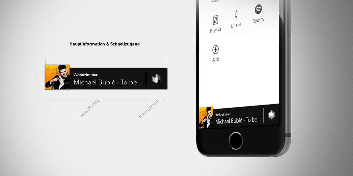
Another feature that was highly necessary, but also highly complex, was the mini-player. To give the user information about what's currently playing and still enable them to quickly adjust their room- & speaker setup, many iterations and constant feedback loops were needed to achieve a satisfactory result.
Since the client wanted the app to be available for both major mobile operating systems, we decided to go with an elegant mixture of both Material- & iOS design languages and interaction elements. Feedback from both user groups suggested we reached a place of clear communication for both parties.

The end result was well-received by the client and lead to an extension of the contract with the intention of explorating translation plans for a tablet version.

Unfortunately, Teufel decided to integrate the sub-brand Raumfeld deeper into their ecosystem, which led to the absorption of the brand and its products resulting in the removal of the app from the stores. To see some more of the finished product, watch the small presentation video below.